Create Beautiful Cross-Page Animations with the View Transitions API
In the past, full page view transitions have always been a bit of a nightmare to build. With single page apps (SPAs), we've had to work around router limitations, and with multi-page apps, it's been impossible.
But now we have the shiny new View Transitions API, which lets the browser handle the difficult bits when transitioning between views, whilst giving us the tools to customise the animations to our hearts' content.
Building my new website gave me an opportunity to have a play around with the View Transitions API myself. The site is open source, so you can jump straight in and look at the complete code if you want to. My website uses Remix, which abstracts some of the work away for me, but I'll try and explain any fundamental concepts along the way too so you can apply this to any framework.
Browser support
An important note before we start - this is still an experimental API, and at the time of writing it's not available in all modern browsers yet. It's worth checking the browser compatibility table on the MDN docs before starting to make sure you're ok with the current level of support.
For me, this was an opportunity to learn the new API whilst adding a bit of ✨ magic ✨ to my website, so full cross-browser support wasn't essential. If it is a requirement for you, it's probably worth using something like framer-motion with react-router, which should allow you to at least create transitions between the pages in your app.
With all that said, let's get stuck in.
A basic crossfade animation
If you're using react-router (or Remix, which is heavily integrated with
react-router), you can enable basic view transitions by adding the
unstable_viewTransition prop to your Link or NavLink components:
<Link {...props} unstable_viewTransition />
If you're not using react-router, you'll need to do a bit more work to enable
view transitions. Wherever you're handling navigation between pages, you'll need
to add something like this:
function yourNavigationFunction(data) {
	// Fallback for browsers that don't support the View Transitions API
	if (!document.startViewTransition) {
		doYourNavigation(data)
		return
	}

	// With a transition
	document.startViewTransition(() => doYourNavigation(data))
}
And that's it! You should now see a nice crossfade between your pages. This is the browser default, and can be customised (and we will be doing that soon), but it blows my mind how easy this is.
If you're planning to add transitions between all the pages on your app, it
might make sense to create a custom Link component with the prop applied by
default, and use that instead of the Remix Link. This is what I did for my
website.
Customising the transitions
Ok, so we have a basic crossfade animation which looks great and was super easy to implement. But as engineers we always want to tweak things, so let's have a look at how we can customise the transitions between pages a bit.
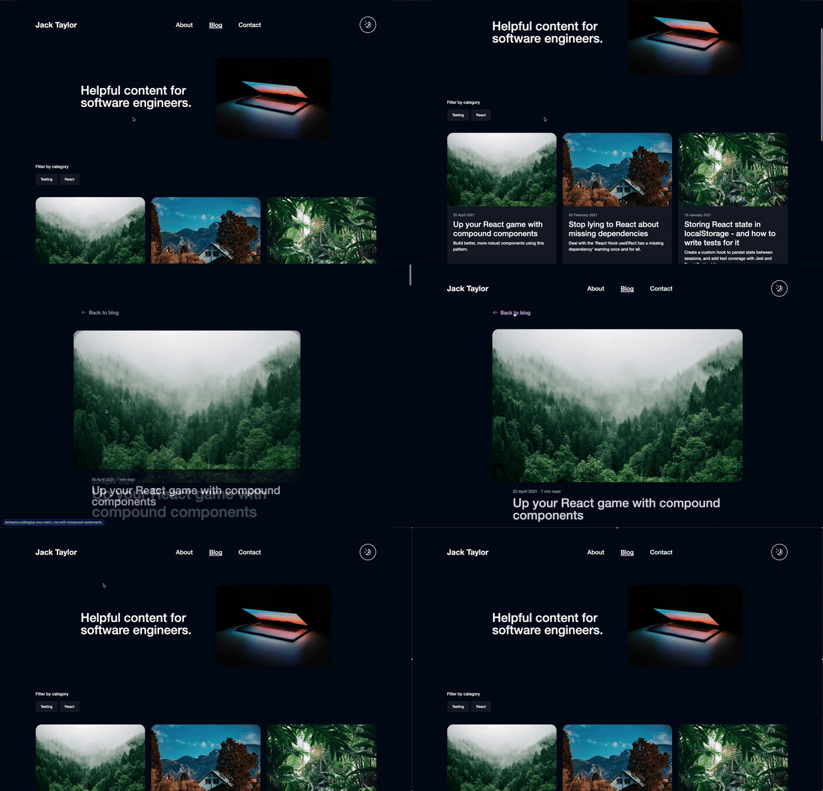
In most apps there are elements which are present on every page, like the navigation. It doesn't really make sense to fade this out and back in again every time we load a new page. There might also be elements that exist on two separate pages, but are visually slightly different. For example, on this website, the blog listing page has a list of blog posts as cards, and when you click on one, you see the same blog title and image scaled up to fill the width of the page.
It's possible to tell the View Transitions API that these are the same elements,
and it will automatically animate changes in size and position of the elements
between pages for us. You do this using the view-transition-name CSS property.
The value of this property needs to be a unique name, and it needs to be present
on each instance of the element which should animate between pages.
You can add this directly to the style attribute of the elements you want to
connect, or you can add a class name with this property and add the class to
both elements:
.your-view-transition-class {
	view-transition-name: your-view-transition-name;
}
If you're using Tailwind, unfortunately there's not
yet support for adding view-transition-name as an arbitrary value.
There's a feature request for it,
but until then you can add a custom component class name with the property
applied, which is
what I ended up doing:
@layer components {
	.your-view-transition-class {
		view-transition-name: your-view-transition-name;
	}
}
With this applied to the navigation on my site, you can see that the navigation no longer fades out and back in between when changing pages:

And when I added a view-transition-name to the image and title on both the
blog card and blog post page, the browser automatically handles transitioning
the size and position of them for me:

More customisation
The animations that the browser provides by default are pretty nice, but it's also possible to customise them further if we want to.
Under the hood, the View Transitions API works by building a tree of pseudo elements - one for the old page that the user is navigating away from, and one for the new page that is being navigated to. These pseudo elements sit on top of the whole document, so the page underneath is no longer visible. The elements of the old tree are then faded out, and the new elements faded in - this is the default crossfade that we started with. The pseudo element tree looks something like this:
::view-transition
└─ ::view-transition-group(root)
   └─ ::view-transition-image-pair(root)
      ├─ ::view-transition-old(root)
      └─ ::view-transition-new(root)
Because these are all HTML pseudo elements, we can target them using CSS and apply our own animation CSS properties. For example, we can change the default animation duration like this:
@supports (view-transition-name: none) {
	::view-transition-old(root) {
		animation-duration: 100ms;
	}
}
The @supports (view-transition-name: none) CSS at-rule ensures that the
stlyes are only applied if the browser supports the View Transitions API
It's also possible to target specific transitions using the
view-transition-name you defined for that element:
@supports (view-transition-name: none) {
	::view-transition-group(your-view-transition-name) {
		animation-timing-function: cubic-bezier(0.215, 0.61, 0.355, 1);
		animation-duration: 300ms;
		/* ...and any other properties you might want to add here */
	}
}
You can go as wild as you want here - it's possible to do anything you can do with CSS animations. Have fun!
Accessibility
It's important to note that animation can cause issues for some users, this should be taken into consideration when adding page transitions. Scaling and panning animations can be particularly problematic for users with vestibular disorders, and can cause dizziness and nausea.
Users can set their motion preferences at the operating system level, and it's
possible to check this preference using the prefers-reduced-motion CSS media
query. The simplest approach is to disable all view transitions if the user has
prefers-reduced-motion turned on:
@supports (view-transition-name: none) {
	@media (prefers-reduced-motion) {
		::view-transition-group(*),
		::view-transition-old(*),
		::view-transition-new(*) {
			animation: none;
		}
	}
}
Bear in mind that motion can sometimes be an essential part of user experience.
If a user has prefers-reduced-motion turned on, it's sometimes better to
replace problematic animations such as scaling or panning with transitions such
as opacity fades, which are less likely to cause issues. You can read more about
this in my article
"Making motion accessible: how to respect users' motion preferences".
Debugging the transitions
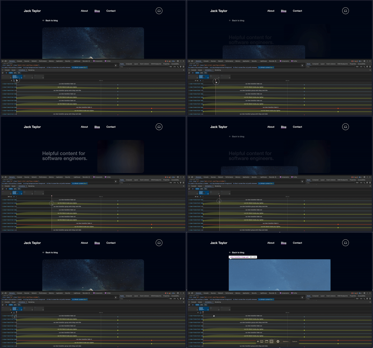
Something super cool that came in really useful whilst building the view transitions for my website was Chrome's animation drawer in the developer tools. It allows you to capture and replay animations, so you can debug them in slow motion and make sure they're pixel perfect. You can learn more about it in the Chrome Dev Tools docs.

Conclusion
In the past, full page transitions have been painful to build, but the View Transitions API now makes it super easy. Just by adding a few lines of code you get so much for free, and I'm looking forward to seeing how things develop as the API becomes more widely adopted. The future of motion on the web looks bright!